Get to know our new design lead, Jeffrey Rabin
In a recent blog article, we talked about our new 3Points branding and website, which better represent our firm’s evolving identity. We have two people to thank for creating our firm’s new look and feel: Chenyu Jiang, our first design intern, and Jeffrey Rabin, our new design lead.
Since you’ve now gotten to know some of their work, we wanted to introduce you to the people behind the pictures, animations, and web pages. A couple months back on our blog, we introduced Chenyu, who created our new logo and the video about it — now meet Jeffrey, who created our new website design and continues to create new branding materials for us. Read on to learn more about Jeffrey and his thoughts on design.
What principles do you think are most important for effective design?
In all honesty, it is hard to pick out specific principles — they are all very important. I would compare it to any sports team, where you can have some very stellar players, but it only takes one or two weaker ones to weigh down the whole team. With any design, you can get a lot right, but with one wrong move, the whole piece can be ruined. Attention to detail is a must with any design, especially in the world of communications, where your work is a crucial factor in brands’ reputations.
How would you describe your design style?
I would describe my style as simple and organized. Much like the messages you are trying to send with your work, the work itself should be clean and easy to understand. However, I think most people would be quick to assume that a simple design can’t be creative. I would counter this by looking at some of the world’s most famous logos such as Apple, Adidas, and Nike. Most of them consist of at most four shapes. There is nothing complex about them, yet they are seen as some of the most creative and memorable pieces of design work of our time.
Is there a specific designer or artist who has influenced you the most?
Honestly there are many, so I am just going to give a few of them a shoutout. Andy Warhol proved that repetition of shape and color can be the key to an effective design, which is a principle that influences my work a lot. Banksy, although considered a criminal by some, has shown the entire world that the simplest works of art can have the most powerful messages, simply based on when and where they are used. And finally, I would say Piet Mondrian — you would recognize his work if you looked it up — because, whether people know it or not, he started the movement toward creating simplified art organized on a grid. I think without those three, the very foundation and basis of my work would not exist.
What interests you about designing for a communications firm?
Very simply, it is the idea that my designs are doing more than just hanging on a wall. The ability to inform, persuade, or just communicate through design is an idea that is really intriguing to me. I’ve always loved graphic design; however, once I got to college, I realized that I wanted to use those skills in the communication industry because of the way my work would reach and impact its audience. I am very fortunate that shortly after my time in college, I was able to earn this opportunity at 3Points, doing exactly what I envisioned myself doing years ago. Additionally, I get to work on something new every single day. Whether it is a graphic to accompany a client’s social media posts, an infographic highlighting a client success story, or creative advertisements to promote another client’s branding, no two projects are the same. The variety in projects keeps me on my toes, and allows me to create all sorts of work on a daily basis.
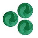
What was your visual strategy when creating our new website?
The core of our new website is the new logo. It sounds impossible that an entire website was designed around three circles with some text, but that is the truth! The colors and animations are meant to replicate the look and feel of our new logo. On top of that, I wanted it to have a modern but very organized look and feel. Designing the site was quite the task because it was meant to deviate from the initial site; I pretty much knew what not to do. The previous page had a white background, and I knew that a modern look would require color and imagery. Additionally, it is very important in today’s day and age that your site look just as good — if not better — when viewed on a mobile device, which meant that as I designed the website on a computer, I knew it would have to contain elements that would also look great on phone or tablet.
You’re a big Marvel fan — which Marvel character do you think has the best design?
You don’t want to know how long it took me to answer this question. I would say that the character with the best design is the Black Panther. Although his suit is simply black, the silver and gray lines and details cannot be ignored. In the movies, as he builds up kinetic energy, the suit’s lines start to fill with purple, creating a stunning effect. Along with the suit, the city of Wakanda in the movies is one of the coolest things I’ve ever seen.